Sunday, February 15, 2009

TyPE IV: My Exploration- DEAD

I have decided to chose one word to experiment with that I felt carries a mixture of meanings and connotations with it.

The word "dead" typically means deprived of life or no longer alive, but what about when the word is used in a phrase or to describe something that is not actually dead. For instance, when someone or something is lacking the power to move, feel, or respond, they can be described as "dead." For example, I am "dead" tired but I am not ready to be buried. The word can be used in many instances, such as a dead battery, dead matter, dead coals, dead soil, a dead law, a dead issue, brain dead, dead air, a dead volcano, a dead language, a dead party, a dead tennis ball, the phone went dead, dead ball, dead water, brought to a dead stop, a dead silence, etc.

....So the word "dead" applies literally to what is deprived of vital force but is used figuratively of anything that has lost any attribute (as energy, activity, radiance) suggesting life.

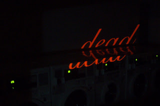
I played around with computer typefaces that had unique character and ornamentation. The word dead looks completely different when typed in Garamond or Futura compared to being typed in Zapfino. I wanted to make the word look pretty and graceful to contrast the meaning of the word. I didnt want to use a stiff, straight typeface while projecting the word upon different surfaces because the point of my exploration is to see how highly ornamented typography can bring meaning to projected type in a 3D space. I still don't think I have brought enough conceptual execution to the table yet, but I'm still trying to figure out better objects that I can project on that would inject more meaning into the word "dead."

Some ideas of surfaces I'm going to project the word "dead" on are:
-still water (pond, lake, bathtub, etc.)
-car engine (pop the hood of my car and project on the engine)
-graveyard (tombstone, hearse, etc.)
-trees, plants, and dirt
-I'm stumped! HELP!!!


Here are some of my recent indoor projections that I documented to show what I have been working on so far.




Friday, February 13, 2009

How To Replace Your Bicycle Tire Manual


This is my groups revised version of our user friendly manual to instruct someone on how to replace or change their bike tire.

Wednesday, February 11, 2009

InfoArch: Further Revision of Layout


InfoArch: Initial Digital Comps

IDEA#1

micro view: after the bud light coaster is selected (for ex.)

IDEA #2

micro view: after the heineken coaster is selected (for ex.)

IDEA#3

micro level: when the red jack coaster is scrolled over (for ex.)

Tuesday, February 10, 2009

InfoArch: Final Rendering of Digital Collection

I decided the best way to render my beer coasters in a way that would present a cohesive set of objects was to select the primary color of each coaster and make the image a duotone of that color. So, the final set shows 12 coasters all with similar tones, but each with their own identifiable color.


Sunday, February 8, 2009

Type IV: Asking Questions and Experimenting


I made a list of a bunch of questions that pertained to my area of interest. Here are 5 of them.

1. Can an environment create new meaning for typography that is projected upon it?
2. What happens when highly ornamented typography is projected onto an uneven surface?
3. How can Marian Bantjes style typography be implemented into a 3D space?
4. How can highly ornamented text imagery be given additional/multiple meanings?
5. Does legibility become an issue when typography is projected into the corner of a room?
6. How can a projected typographic image be used in combination with a grid?
7. Can a grid define a new typeface from a distorted existing typeface.
8. How can new meaning be added through ornamentation to a gridded typeface?
9. Can a word be given new meaning just by the ornamentation it is constructed with?
10. How can a "designalogue" banner be created by combining projection experiments with grid experiments?

I want to create a typographic image that contains complex detail and ornamentation and then experiment with projecting it onto different kinds of surfaces..such as a pile of trash, the corner of a room, different layers of fabric, textured walls, and other surfaces that would not usually be used as a projection screen.

INSPIRATION:
HERE
Tobias Battenberg took a projector and Akzidenz Grotesk out onto the streets, and came back with these fantastic images.