Wednesday, October 29, 2008

comm. models- "system" postcard


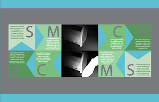
When the output (or "products") function along side other products, it forms a system. I tried to visualize a system with my original postcard and the new product that my partner created with his own added imagery that supports my message of the shoe shining box becoming an obsolete object.

I had to research additional information that supports my visual dialog. I am now trying to place the product in a "historical" contextual system.

• What is the impact/relationship to other products?
By using an old newspaper article from the time period of WWII (aka 1939-1945) I am relating my shoe shining box to this time period. The cutout of the missing shoe is no longer a white space, but now it is part of the overall system I have created. The newspaper give an indication of when the decline of shoe shining began.

• What is ONE argument (from a historical point of view) that can be made about the object?
Shining shoes was a respectable form of urban living in the past and gave many successful business types their first foot hold on the corporate ladder. Before the Depression, no bustling city street in the US was complete without fleets of shoe shine boys armed with their homemade wooden shoeshine box, cheap black and brown shoe polish and old cotton rags, all in an eternal quest for nickels and dimes. After the Second World War the enterprising business went into steep decline but personned, shoe-shine stations could still be found in main airports and big city underground garages etc. As the decades have passed, the amount of shoe shiners have decreased even more, mainly because the shoes that are in need of a "shine" are not as popular anymore.

• What are the ramifications or benefits of this system?
This system that I have created results in the viewer gaining knowledge of
a) what the object being shown actually is (the cutout shape of the shoe is an index of what the shoe shining box is used for)
b) what the missing shoe creates as a product ( "shoe shining is becoming extinct, because people don't need their shoes shined anymore")
c) why and when did the depreciation of my object begin?

• How could that engage in a dialectic based on the second postcard?
The second postcard left a lot of things open for question. Why did the receiver of my original postcard cut out the shape of a shoe and leave the composition with such tension and uncomfortable balance? What exactly was he intending to say? The system I have created explains and defines what I thought he was trying to say with his output postcard.



Friday, October 24, 2008

Communication Model: Infographic Ideas

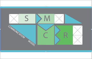
These are my two pre-final communication models. In my process documentation book I will include both the "blank template" for the general communication process and then I will also have the "annotated example" of my specific communication process through the first cycle of the postcard project. So, yes, two separate models.


I finally found a format that will work for my communication model that shows the process as a continuous cycle of a source sending a message through channels that gets received and then the receiver becomes the sender of a new message that he sends back to the original source through channels. I included image boxes (5"x7") after the message so that the viewer can have an example to learn from and so that I can drop in my postcards and include my personal annotations and the dialog between my partner and I.


So, initially, I was having a lot of issues with the layout of my communication model. I was having difficulty figuring out how to show the process from the sender and the message, through the channels and to the source. I was trying to create a blank template that shows Berlo's basic components but make it so that I could drop in my specific annotations created from this postcard project. So I am using a white box as a place holder for where the actual image would be in my model. I plan on using two of these diagrams in my process documentation because that way I can show the way the communication model works in general and then how the communication model works with my own annotations and dialog.

These first few ideas below were unsuccessful because they were confusing my classmates during the process critique. People were confused as to why I had an image box connected at certain points and not at others. I realized that I need to show an image box attached to the original sender/message and then again after the receiver becomes the sender and creates his own message. I also was forgetting that this is a cycle and the receiver doesn't just create a message based on how he interprets the original source's message, but he actually becomes the sender and the cycle repeats itself from there.


Communication Models: Output Postcard

Thursday, October 23, 2008

Communication Models: Examples

Images that I found that I think are neat/interesting and how I feel about them:
Good ( Interesting)
BAD (not appealing)
Good (Colorful)
Good (kids are cute?)
Bad (creepy)
Good (beautiful)
Good (funny)
Good (ha ha...wow)
Bad (confused) but also Good (cute)
Bad (slutty)
Bad (dark and weird)
Bad (chilling)
Bad (sad)
Bad (desolate)

Wednesday, October 22, 2008

phase 2: Output Postcard

At this point, I feel like I'm really struggling with this communication project. Im getting very annoyed and stressed out at my lack of creative juice for this portion of the project and I really need some help. I don't know if its because I have no interest in the Soviet Sniper badge or if its just I dont know enough about it to communicate another level of information to embellish it. I sure as hell tried as hard as I could and I have run out of time.

I think this red background one is going to be my final output postcard because it is the most unique and has a new feeling of "collage to it" The red references blood, war, and the soviet Union's flag. The bullets can create a message that relates to the sniper badge but also, a big pile of bullets can symbolize success or defeat, whichever way you look at it. 
This one tacks the sniper badge on top of a photograph of some sort of Soviet city square. Its kind of boring but might produce a new level of read. Why does the badge relate to this touristy type of image. How does my convention effect how you interepret it?
This one has a military parade photograph with the badge tacked on top of it. Its also kind of boring but has a powerful message of negative military organization and maybe the idea of authority. 

These two ideas are similar but I played around with the lighting to try to break away from the black/white automatic negative connotation. I added a whole bunch of bullets in the background, making them the secondary subject but still adding more to the story of the image.


I added bullets and a few filters to the original postcard to communicate a new message that clarifies what the badge is for. At first look, the receiver may not have known it was a sniper badge because the guns on it may not have been obvious enough. So I think my addition helps send a more clear message.

For this idea, I decided to place the object (using the same original postcard photograph, of course) into an environment that would create the idea of an interrogation room. Since the object is a sniper badge, I see it as being an object representing something top secret or a conspiracy. I tried to personify the object and make it be like a person sitting in an interrogation room being question for some sort of crime. 

For this direction I tried to enhance the lighting effects that were present in the original photograph. I feel like the object is being put in the spotlight and I made this more literal. 

I added a set of handcuffs to the original photograph to produce the idea of the arrest or conviction of a soviet sniper. 

Thursday, October 16, 2008

comm models: object postcard

postcard process

I just started experimenting with how to show my image in a way that would communicate a positive or a negative tone. I have decided that black and white photography definitely portrays a more negative tone for my object and a colored image that gives clearer detail to the characteristics of my object, may in fact make it appear more positive. I played around with cropping while keeping the same general angle of my object. I might try to rethink a new perspective of it, one that doesn't show it so dead on. Maybe play with depth or looking up at it or maybe looking more down at it.


Wednesday, October 15, 2008

Final Exhibiting Semiotics Presentation


The object I chose for my exhibition is denotative of an antique shoe shining box. It connotates the words old, used, and handy while representing a very important object for certain people who rely on shoe shining as a career. Through the course of this project I was able to narrow down my target audience down to men in their 20s and 30s who are, in most cases, living and working on the streets. Shoe shining can be seen as a sidewalk craft for the homeless. They make spare change by polishing the shoes of business men on the corners of city streets. I chose to represent my object as a symbol because I didn't want to be extremely literal with a direct icon or index of a shoe shining box. However, I do think that the way I rendered my final symbol is highly motivated to the idea of shoe polishing.  The convention of my symbol is that it is showing a swirl of shoe polish that is on a smooth surface, such as leather. At first, I had made a shoe polish swirl on a regular piece of paper and then scanned it in to photoshop. I realized that it wasn't convincing enough because it lacked the real qualities of a polished shoe. So I remade the mark on glossy paper that made it appear more like a real shoe polish swirl would appear on a shoe! I considered using a vectored version of my symbol, but this was not motivated enough for what I was going for. I used my exhibit title to relay the vague message of "Polished to Perfection" and to really hint directly towards my object and exhibition content. My typefaces that I chose also support my object and exhibit's purpose. I used an elegant and curved typeface that is almost cursive looking because I think it appears very professional, finished, and clean- all of which enhance my parole. I also used a handwritten typeface for the exhibit title to hint at the idea of my object symbolizing the handcraft of shoe shining. It gives it a more personal touch, as a shoe shining box is personalized by each person who owns one.  The colors I chose reference my object and the brown shoe polish directly. I used white and a dark brown as my secondary colors because they add contrast to my pallet. Overall, this project taught me how to consider semiotics while attracting an audience to want to come check out my museum exhibit.