Wednesday, April 30, 2008

Placards in Flash


Untitled from Kyle Huber on Vimeo.
WITH HEARTBEAT SOUND THAT LOOPS

Tuesday, April 29, 2008

Color Experimentation For Image Concept 1

Here is my ideas for the first image concept. I kept in mind my icon connotations while trying to chose a color pallet. Not sure if its working or not. Yay? Nay?


Color Experimentation For Image Concept 2

I really need to narrow down some of these that aren't working. I need some advice from an outsider. Thanks.


Monday, April 28, 2008

Image Concept Compositions

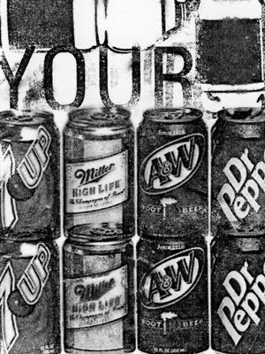
I have taken my initial concepts and experimented with ways to present them formally. I used acetone to transfer my images onto an index card and played around with different scale changes, repetition, layering, composition, and legibility. These are my most successful results so far. I am leaning towards image concept two for my final project.
Image Concept 1:


Image Concept 2:


Wednesday, April 23, 2008

IMAGE CONCEPT IDEAS


For the first image concept, CONTRAST, I want my placards to consist of my icons being compared to an unhealthy opposite of its function for your health. So for the scale icon, which represents fat loss and weight management, i will contrast it with an image of fast-food, like a Mc Donalds burger or something. For the treadmil icon, which represents cardio and running, I will contrast it with an image of a couch or a tv which represent laziness and inactivity. For the water bottle icon, which represents healthy hydration and your body's need for water, i will contrast it with an image of soda or alcohol.

For the second image concept, COMPARISON, I want my placards to consist of an environment at home where the icon fits in with the objects around it. My dumbbell icon can sit on a shelf with heavy household things such as milk jugs, cans of soup, or bags of flour. My Jumprope icon can sit next to extension cords on a shelf. My swiss ball icon can be placed next to some balls used for sports such as basketball,soccer,volleyball,etc.

For the third image concept, LOCATION OF BENEFIT, I want my placards to consist of very illustrative images of the muscles that my chosen icons benefit or build. I will place my icons on the muscle groups in an interesting way or maybe even within the actual muscle. I will use an image of the abdominal muscles or the core with my swiss ball icon. I will use my dumbbell icon with an image of biceps. I will use my treadmill icon with an image of legs or maybe the heart.

Sunday, April 20, 2008

Final Magazine Spreads and Infographic

While developing my infographic from start to finish, I tried to keep in mind how it would fit into my magazine article with a strong level of consistency. This created complications, but because of it, my infographic has changed dramatically since my first ideas and with each refinement came a new level of complexity. My color pallet is considered throughout the spreads and I tried to stick with the same colors as I finished with at the last stage of this project. I brought in an orange to break the masculine connotation that may have been overpowering my magazine spreads. Since my article is about body sculpting being made easy, referring to the fact that both men and women can do it, I needed to incorporate a color that not only fit the gym theme, but also was a complimentary color to both genders. I employed graphic elements like the horizontal gray color bar that runs across the top of the first two spreads and then is implemented into my infographic on the third spread. My infographic communicates information on different levels such as within the pie chart and within the text in the right columns. The colors are very important in coordinating each object and where they fit into the workout. I used a gradient to help with legibility and also add a more dynamic feeling to my text. Repetition is also included in my design because it is something that is important while exercising and working out. The typefaces I chose also compliment the theme of my article and are very structured with great form. My spreads and my infographic speak in a simplistic, clean, and controlled manner while communicating a friendly and clear set of information that is meant for a beginner.


Friday, April 18, 2008

Final Book Cover Designs


This is my series of books designed for Michael Kidwell's Image class.

Wednesday, April 16, 2008

FINAL INFOGRAPHIC


I still think my big info text box seems weird where it is, but this is where Im at right now for the final review. I adjusted a lot of things, like the rings around the pie chart, the text alignments, the thin black box containing the icons, etc.

Tuesday, April 15, 2008

Magazine Spreads with Infographic

This is what I have so far for the compilation project for Michael and Jamie's classes. I need to find more images of women lifting weights to use for the final spreads. I think the color pallet is working overall. Maybe change the image or delete the image behind the infographic. Replace it with orange?


Monday, April 14, 2008

Infographic Updated

I adjusted the far right side. The text was cutting it too close to the edge and it was bothersome. I also adjusted the color of the numbers based on its opposite side of the gradient. I think legibility improved.


What do you think about the orange bar that includes the paragraph? I added the text info box to explain to the viewer what the purpose of the infographic is. I talked about who needs to exercise, when, how much, and why. I also fixed the alignments on the "quick tips" and "by the number" columns.


This is the infographic that I have arrived at as of now. I will include it in my magazine spread for Michael eppelheimer's class. It might need a few final tweaks but I think the layout and the color choices are good how they are. Any suggestions?


My Photography