Tuesday, September 30, 2008

Sunday, September 28, 2008

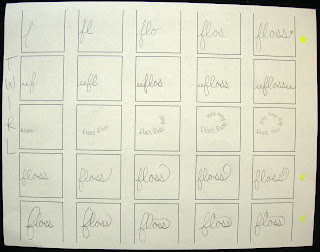
Flossing Story Board


Inversed- Flossing Pencil Animation from Kyle Huber on Vimeo.


.5 second time increment and the verbs I used are twirl, wedge, and remove.

Monday, September 22, 2008

Kinetic Type: Initial action story boards.

These are my 3 story boards that show my transitions from one action to the next. Since I'm using the noun floss, I decided to make my typeface a thin cursive like string of letters that resemble floss. Im sticking with my idea of being instructional and Im using my actions of twirl, wedge, and remove to show just how the floss works while practicing hygiene. The floss is first twirled around your fingers, then wedged in between teeth, and then used to remove particles from in between your teeth. So My actions will narrate a story of beginning to end, the action process of flossing your teeth!


TWIRL


WEDGE


REMOVE

Saturday, September 20, 2008

Visual Language: Project 2

EXHIBITING SIGNIFICATION
Project Description: 
Using semiotic theory, a visual matrix and a generated word list...create a visual language system that promotes a museum exhibit targeted to a specific audience.

1. choose an object/audience. imagery will be based on a (recognizable, complete) object from a junkshop, antique store, grandma's attic, goodwill, etc. that you bring in to class. an audience will be chosen to communicate to--some group that would use the object on a regular basis or be interested in it in some capacity. 

SO... after exploring a local antique shop, I found an object that really interested me. It is an old wooden shoe shining kit. It is a handheld tray that doubles as a foot rest for the shoe that is being shined.  
Here is a picture of the actual object I will be using.

-Define an Audience that would be interested in this object and discuss basic info: 

My initial reaction to this object was- 
Considering this is an object that represents the occupation of shoe shining, I would say that my target audience would be the lowest working class, mostly comprised of homeless African Americans.
But from doing research I found this information-
Being a shoeshiner is a profession in which a person polishes shoes with shoe polish. They are often known as shoeshine boys because the job is traditionally that of a male child. While the role is deprecated in much of Western civilization there are children that earn an important wage for their family in many countries throughout the world. In Afghanistan some children will work after school and can earn 100 afghanis (around £1) each day. Many well-known and high profile people started their working life as shoeshiners, including singers and presidents.

ALSO:
Shining shoes was a respectable urban living in the past and gave many successful business types their first foot hold on the corporate ladder.Before the Depression, no bustling city street in the US was complete without fleets of shoe shine boys armed with their homemade wooden shoeshine box, cheap black and brown shoe polish and old cotton rags, all in an eternal quest for nickels and dimes. Shoe Shinning parlors were commonplace in CBDs all over North America, opened for business from early in the morning until very late at night. After the Second World War the enterprising business went into steep decline but personned, shoe-shine stations can still be found in main airports and big city underground garages etc. Shoe shine boys still operate in many parts of the world including South America, Africa, India and other parts of Asia. Many street children use shoeshining as their only means of income but care is always required because some are petty criminals in disguise. 
Many of the street urchin shoe shine boys are pray to extortion and need to bribe officials to keep access to prime spots. Railways tender different stretches to shoe shine agencies who then supply “official shoe shiners. ” They may be charged extra day rent by the Railway and need to pay for the privilege of working as an agency shoe shine boy. Many take loans from moneylenders to pay contractors and become desperate to work. Shoe shining has become a modern metaphor for ‘rags to riches’ and is featured in popular culture from around the world.
Shining Shoes

My audience is interested in this object because for many, it was their tool to make money. Shoe shining was their only form of income and it was their career. This object is not as commonly used in the US anymore because of the fact that shoe companies have changed the way we slip-n-slide in and out of the sports footwear. Shoes that need to be polished are rare on the streets these days. This object represents poverty, hard work, masculinity, and lower class. 

Additional Images I found relating to my object that may be helpful.


Thursday, September 18, 2008

FINAL STATEMENT & POSTERS FOR CRITIQUE:

Project Documentation
Request Off Poster
Priorities Poster
(right click each link and open in new window to view pdfs)

In order to address my audience in the most effective manner, I had to gather background information about their shared values and their cultural references. I then considered their graphic landscape while also trying to create a message that would target them by the usage of rhetorical tropes. After much exploration, idea refinements, and concept building, I was able to narrow down my two poster designs.

The first poster I chose to go with implements a message to the members of my demographic, who are employed either full time or part time, that voting on November 4th should become part of their schedule. A main excuse I found for lack of voting in past elections was because my demographic claimed they could not get off work to vote. I thought about the ridiculousness of this explanation and decided to use a hyperbole to create an exaggeration of many employees requesting off on election day this year compared to the other days of the month. In doing so, I am sending the message to my audience that not only is it easy to request off work for one day, but that it is important to do so. I believe by showing a "request off calendar" on my poster, my "call to action" is emphasized by the relationship my audience may have to the content. My formal approach of using photography as my medium creates a feeling of reality for my audience. My goal was for them to want to visualize their name on the calendar to make sure they have the availability to vote on election day!

The second poster contains a bold message to my audience through an ironic display of image and text. Its ironic that all of the things my demographic consider important (television, computers, video games...aka... technological entertainment) are being displayed with the words "Rethink Your Priorities." After researching the values of my audience, I realized that young adults these days are obsessed with the technological world full of distractions, such as time consuming internet networking websites, never ending video games, sports and reality tv shows. While all of these forms of entertainment may seem important, Im trying to send the message that voting should be a priority. I think my use of irony is evident in the way I juxtaposed several of the important time-wasting objects with a voting pin.


Kinetic Type: Action/Object Concepting


My two objects are going to be:
1. toothbrush- polish, clean, reach, and sweep
2. floss- weave, scrape, wedge, wrap, guide, remove, wipe

VERB DEFINITIONS:

TOOTHBRUSH
clean= to make something free of dirt, stains, or mess. 
reach= to stretch out or extend an object in a specified direction in order to touch or grasp something
sweep= clean an area by brushing away dirt or litter. to move or remove in such a way. move swiftly and smoothly.

FLOSS
twirl= to spin quickly and lightly around 
wedge= to force into a narrow space or position
remove=to take something unwanted or unnecessary away from the position it occupies. to eliminate or get rid of. 


Since color and typeface/lettering choice is open on this project, I get to chose my typefaces and to do so I looked closely at the form and detail of the letters and thought about their formal relationship to my words. I attempted to visualize a formal connection between the chosen typefaces/lettering and the object words which function conceptually as a unit.  So to do this, I thought about what my two nouns look like and how they exist in terms that may also relate to a typeface. 
1. toothbrush- long, strong, stiff, flat, gripped, bristles, flexible
2. floss- thin, soft, threadlike, silk, smooth, lightweight, flexible

I then researched typefaces and found several that I think will work well with the characteristics of my objects. 
1. toothbrush- bank gothic light, clarendon roman, copperplate gothic light, courier new regular, DIN, eccentric std, frutiger bold, futura bold, helvetica book, impact, news gothic. 
2. floss- edwardian script regular, frutiger light italic, courier new italic, new caledonia italic, baskerville italic, bikham script pro regular, apple chancery


Wednesday, September 17, 2008

Receptivity- Poster Project

These are the questions that I had to answer in regards to my audiences idea receptivity to move them forward.

where is your audience on this receptivity gradient?

I think the 18-25 year old white americans who are not in college are ready to know and know the facts but are just distracted by the things they are involved in or with. For example, I think most kids my age know that voting is important to our country, but they also have distractions such as computers, television, video games, etc that may out weigh their motivation to actually take the time to go and vote. They also have other responsibilities such as work that may seem more important than voting.


how did the specific rhetorical tropes you employed move your viewer up the continuum?

At first, I experimented a lot with parodies on "myspace" and realized that by using a play on words that I could catch my audiences attention and make them realize they are wasting their time on things that are less important in the long run. I ended up using HYPERBOLE to show an exaggeration in how important it is to be available to vote on november 4th. By cramming a bunch of names into the square on the calendar, I was dramatizing the demand for my demographic to request off to go vote. Obviously its not like they need the whole day off to go vote, but by showing a comparison of 10 names off for one day compared to next to no names for the rest of days off, I am making my point.

I also use IRONY to compare the images of televisions, game controllers, computers, etc to the words "rethink your priorities" because obviously these objects are all very important to my audience. My demographic is obsessed with the internet, watching tv, and playing video games. They often become priorities when school is not a factor of their daily lives. I think its ironic that these technological distractions can be more time consuming than the actual act of voting, but to many young americans, they don't care! I hope my message is a clear call to action though. They need to wake up and realize whats truely important and set these distractions down for long enough to go vote!

how did you frame your call-to-action differently than if your audience was plotted at a different point on the gradient?

If my audience was "not ready to know" I would have had to make a more blatant and less conceptual call to action that stated something boring like "GO VOTE. LET YOUR VOICE BE HEARD. IT IS VERY IMPORTANT....etc." But since my audience knows deep down inside that they probably should go vote, I tried to target them by using subject matter they are very, very familiar with. Anyone who has a part time or full time job knows that there is a request off calendar and they can relate to my poster because of the message my trope creates. The poster not only says that voting day is on november 4th and that they should request off for it.. but it also gets them to think that, hey other people are doing it, I guess I should too! If my demographic was not ready to know then they would be unchanged by the message Im implementing.

I GUESS THE BEST WAY TO SUM IT UP IS TO SAY THAT: Im trying to get my audience to just take the time to go vote, not tell them why its so important (for they probably already know its "important"). Laziness and lack of motivation is their biggest excuse, so by pointing out how to re-prioritize their time, I think Im getting their attention!

Peer Critique

These are the two posters I want to have critiqued by my partners. My audience is the 18-24 year old white americans who are not enrolled in college. Please comment your thoughts and ideas for final refinement. 

Monday, September 15, 2008

Poster Directions- FINAL IDEAS

I came up with a more interesting way to create a composition out of m subject matter and the idea I already had that lacked an interesting layout/composition. I LOVE IT NOW!


Does White Text work better? I think it might because it makes the objects that are less important be the darkest thing on the poster. 

This is my other final direction. I remade the calendar and took better pictures of it that are cropped to make an interesting composition that still gets the message across with out actually saying "GO VOTE."


Here are some text ideas I came up with. They are a lot more modern then using a computer typeface. What do you think?


For My first Idea, I am comparing watching television or playing on the computer to voting. My demographic has priorities that may keep them from voting or distract them from using their time more wisely. I think this concept is strong for a poster direction. I played around with some image and layout ideas. Not sure what I like yet. 


Here is my second Idea. I am using a parody on Myspace and relating directly to my demographic who is obsessed with computer networking websites. 


Here is my 3rd direction. I am using the idea of the the importance for full-time workers to request off work to vote. Its pretty self explanatory.